Simplifying IMPS Transfers for Effortless Banking
.svg)

Client
Bank of Baroda - It is second largest public sector bank in India
Collaborators
1 UX Researcher, 1 UX Designer, 1 Product Manager, 2 Senior UX Designer, 3+ Developers, and a Business Analyst, working closely with stakeholders from BOB
Project Type
Fintech
B2C Banking
Mobile Payments Native App
Transaction UX
Timeline
5 months
My Role
UI Execution & Iterations, Feedback Implementation, Cross-Functional Collaboration, Research Assistance, UX Audits, User Flow Creation, Interaction & Visual Design, Prototyping
Team
.avif)
The Goal
Improve IMPS transfers by simplifying the dashboard and fund transfer flow to reduce transaction drop-offs
IMPS (Immediate Payment Service) is India’s 24x7 real-time bank transfer system, allowing users to instantly send up to ₹2 lakh (approx. $2,400 USD) per transaction
Success Metrics
IMPS transaction drop-offs reduced by 50%, enabling 7.5 million users to complete transfers smoothly within just 3 months
Metrics were sourced from Bank of Baroda’s post-launch analytics; validated qualitatively through usability testing

The Challenge

50% of 10M+ active users failed to complete external fund transfers via IMPS
During the requirement gathering sessions, prioritizing the “Accounts” section out of the five key areas was a strategic business decision

.svg)

.svg)

Why Accounts?
.svg)
Validating Focus Areas With Customers & Staff


What We Learned from Stakeholders
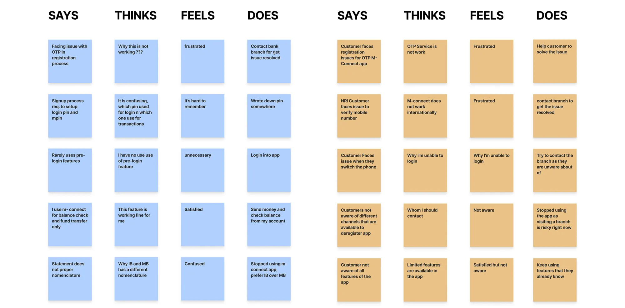
Key features were missing
Account overviews were missing
Transfer methods confused users
IMPS issues drove in-person support
Auditing for Friction Points

Key actions were buried under irrelevant details

No clear guidance on transfer methods

Crucial info lacked structure and confirmation clarity

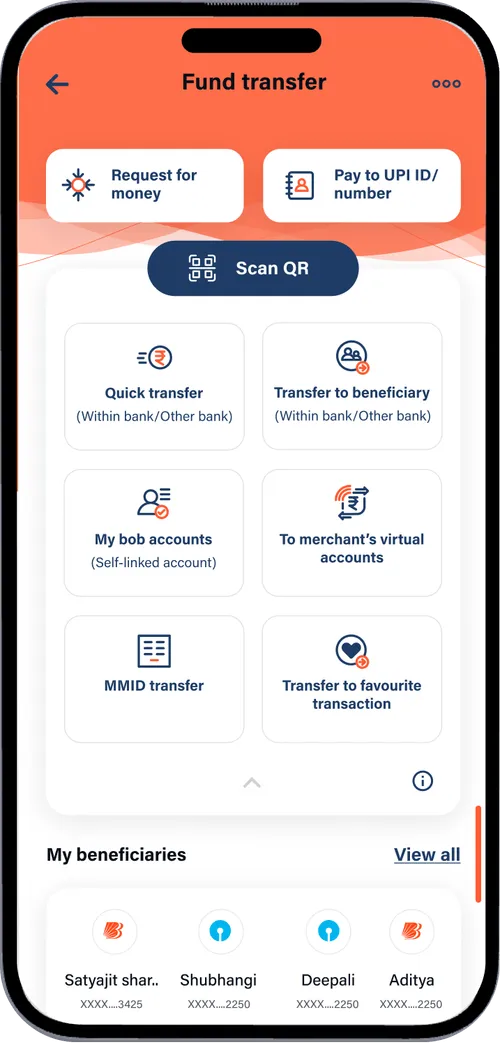
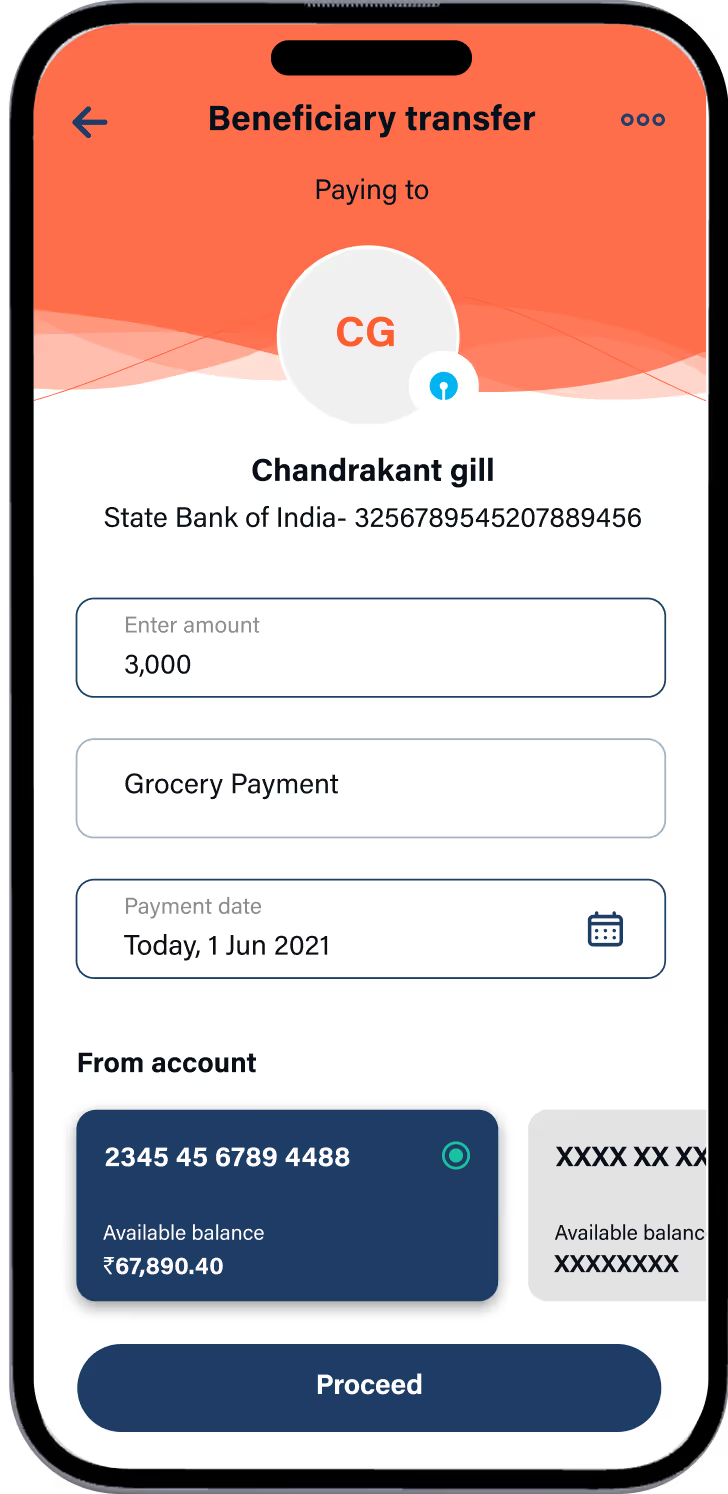
Iterations Shaped our Final Designs


Final Designs
.avif)


Reflections
Ground level insights with stakeholders deepened my understanding of user pain points
Understanding business decisions behind design shaped my problem-solving approach
Every iteration taught me to stay curious, refine boldly, and uplight my visual craft

