Simplifying Credit Card Discovery & Application

Client
Equitas Bank - Small finance bank in India launching their first credit cards.
Collaborators
1 UX Researcher, 3 UX Designer, 1 Product Managers, 3+ Developers, and a Business Analyst.
Project Type
Fintech
B2C Banking
Credit Card Application
Native Mobile UX
Timeline
6 months
My Role
Stakeholder Management, Cross Functional Communication, Insight Generation, User Workshops, User Flows, Design System Collaboration, Interaction Design, Visual Design, Prototyping
Team
.avif)
The Goal
To drive credit card adoption by improving product visibility and simplifying the application journey
Success Metrics
Applications grew 287% within 6 months, with 22k completions and 11k cards activated.
Measured through Equitas’ internal post-launch analytics and credit card activation reports.

The Launch Gap
Equitas Currently
Only has a static website; newly launched credit cards lacked visibility and easy access

Equitas Aims To
Drive credit card adoption through a mobile-first approach to meet business goals


Introduced the cards during app onboarding to boost early visibility
Clear benefits and key card info enabled instant decision-making and application
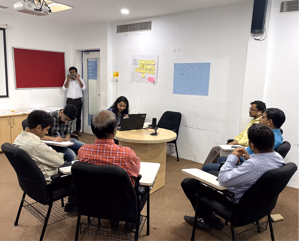
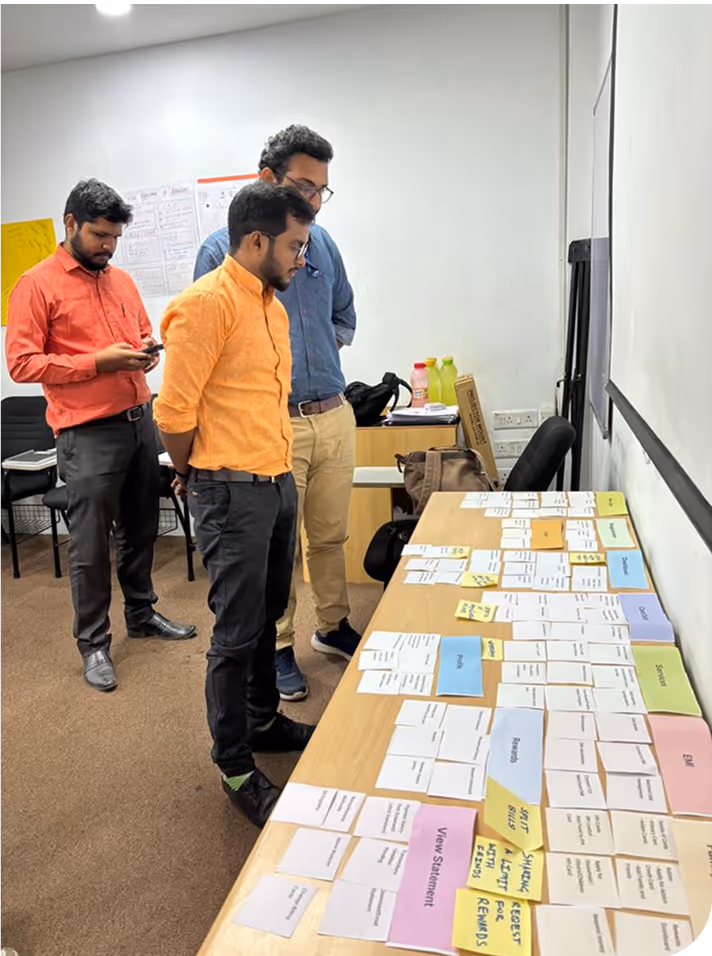
Card Sorting Workshop


"Why not just show the card first?That's what people want to see."
"Delivery address makes more sense after I choose the card."
"KYC and e-signing feel serious - don't mix them with basic details."
"Too many things together could overwhelm maybe breaking it down."
These sessions helped us envision how NTB (New to Bank) users could apply for credit card, and storyboarding further helped us outline key flow steps before diving into design.
.avif)
With the application flow clarified, we established a design system to ensure visual consistency across all touchpoints.
Design System
A scalable type system and modular components ensured clarity. Equitas Blue and gradients reinforced the brand. A 4-point layout grid, strong contrast, legible type, and tap-friendly design supported accessibility.


With the foundation set, we began crafting key screens and the application flow

The Journey to Get the Card
.avif)
.avif)
Introduces card benefits upfront to hook NTB users and drive immediate application entry.
Reinforces key benefits and guides NTB users with consistent messaging to build trust.
Outlines next steps to set expectations and ease the start.
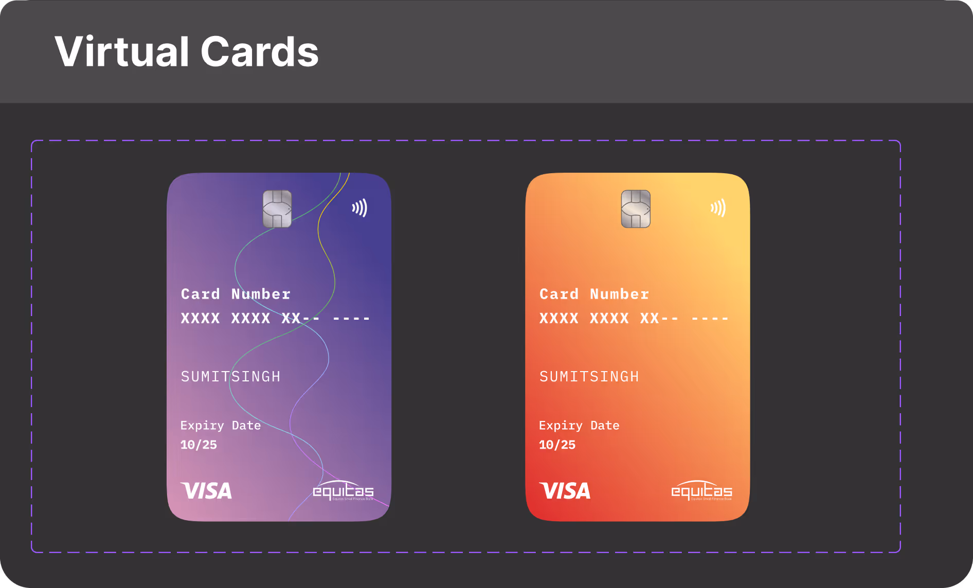
Confirms submission and directs the users to their virtual card for instant access and closure.
.avif)
.avif)
Reflections
Learned credit card systems and business alignment through BRD analysis.
Learned balancing user, business, and technical needs through feedback.
Workshops sharpened decisions and improved designs.