Increasing Article Engagement with CNN

Client
CNN - It is a multinational news organization across television, digital and mobile platforms.
My Role
User Research, Competitive Analysis, Ideation, Interaction Design, Visual Design Prototyping, Usability Testing
Project Type
News Transparency
B2C Media Tech
Native Mobile UX
Transparency Layer Design
Timeline
8 Months
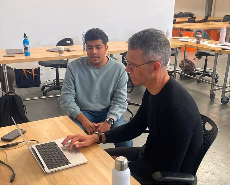
Design Leaders at CNN

CCA Mentors

Our Team
The Goal
To help consumers better understand news articles and rebuild trust in CNN by improving how credibility is communicated
Success Metrics
Trust perception improved by 36%, with 2.4× more readers reading articles when credibility was communicated more clearly.

The Trust Landscape
Through secondary research, we found a sharp decline in public trust towards major U.S. news organizations
We saw the numbers, now we wanted to understand the why behind them which led us to understand what drives or breaks trust at a personal level
User Perspectives

These conversations helped us prioritize the most meaningful patterns, leading to three core insights
People want to be informed, but don’t trust the source
There is a growing trust in independent news sources
The way news is framed changes how people understand it
Similar Patterns at CNN
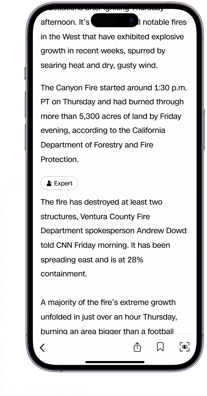
No clarity on article type
Lacks expert perspective and context
Lacks visible sourcing & credibility markers
We translated these patterns into a How Might We statement
How might we design a transparent & digestible news experience that builds trust by making consumers feel informed?

Approach 1 - Transparent Scoring System
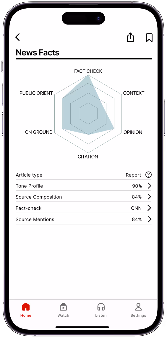
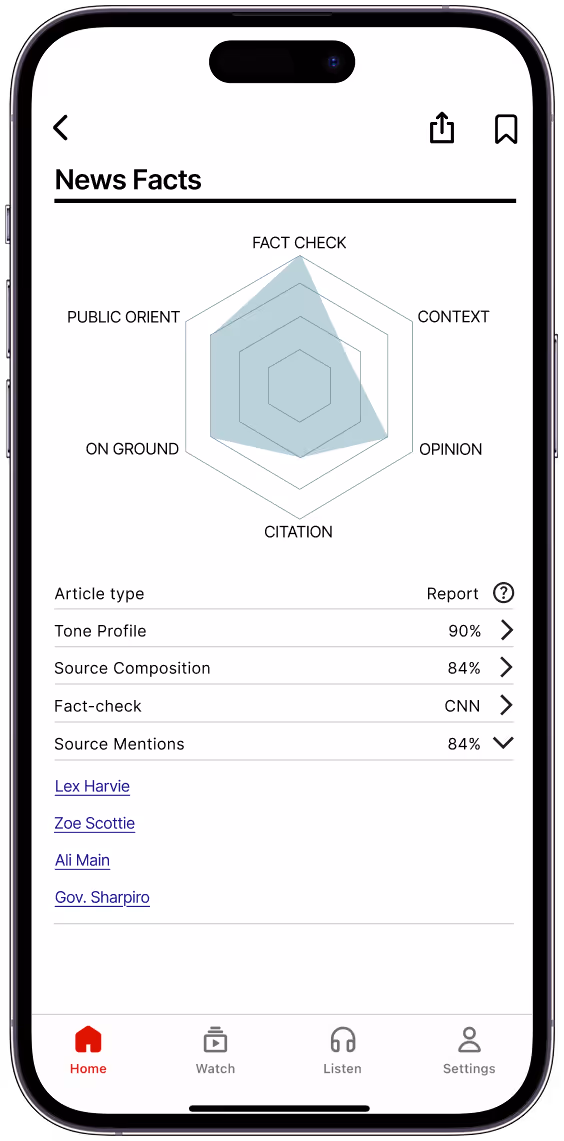
We used AI to score articles on transparency, sourcing, accuracy, tone, and bias, exploring a new standard for news
Limitations We Uncovered
We realized scoring news on neutrality stripped away nuance, while trust comes from surfacing context and evidence that let readers form their own judgments.
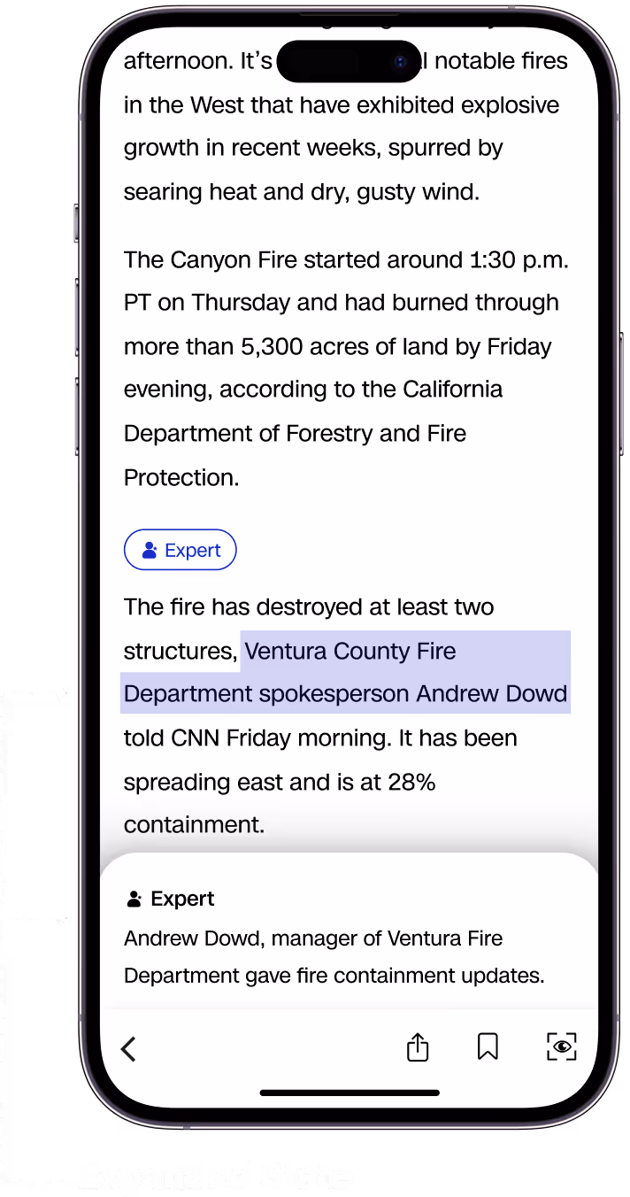
Approach 2 - Proposed Transparency Feature

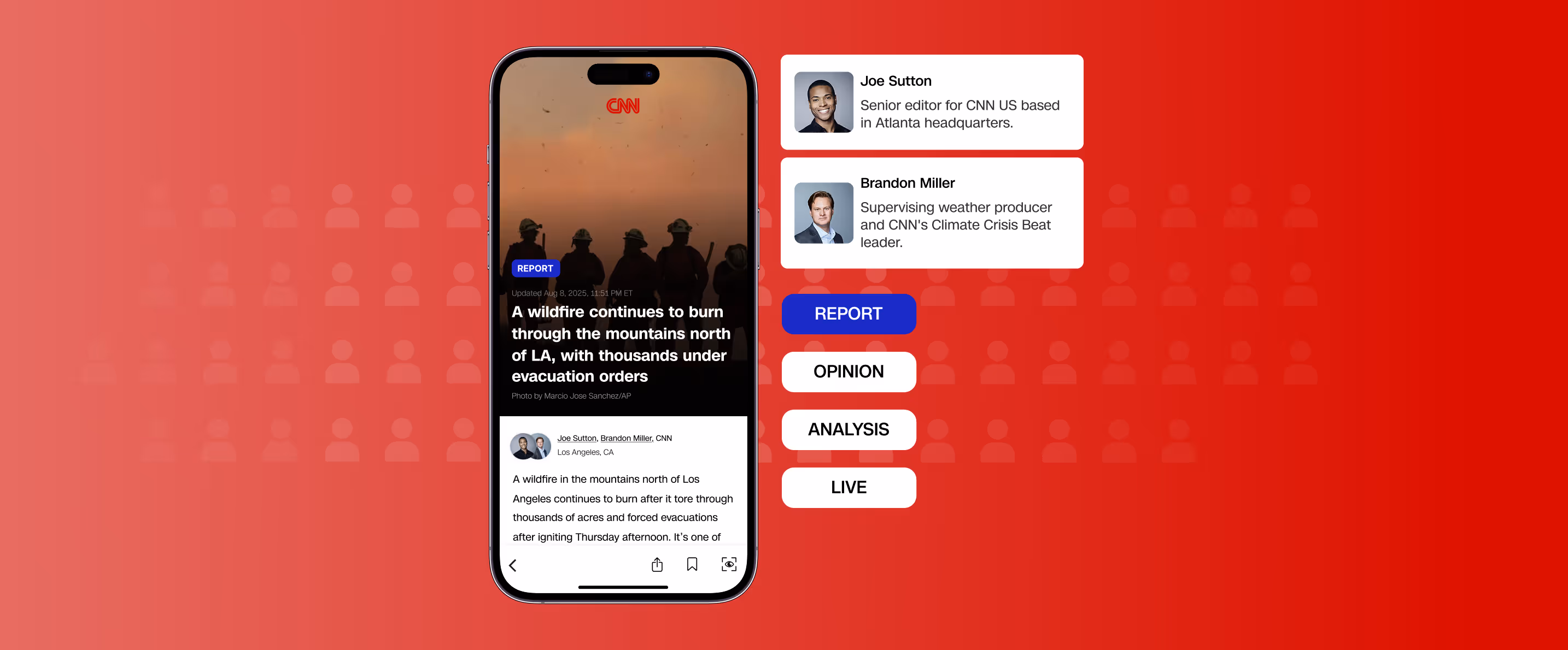
We embedded transparency into the article through Lens, keeping it visible with optional deep dives for more context
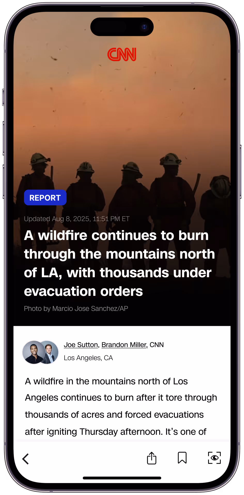
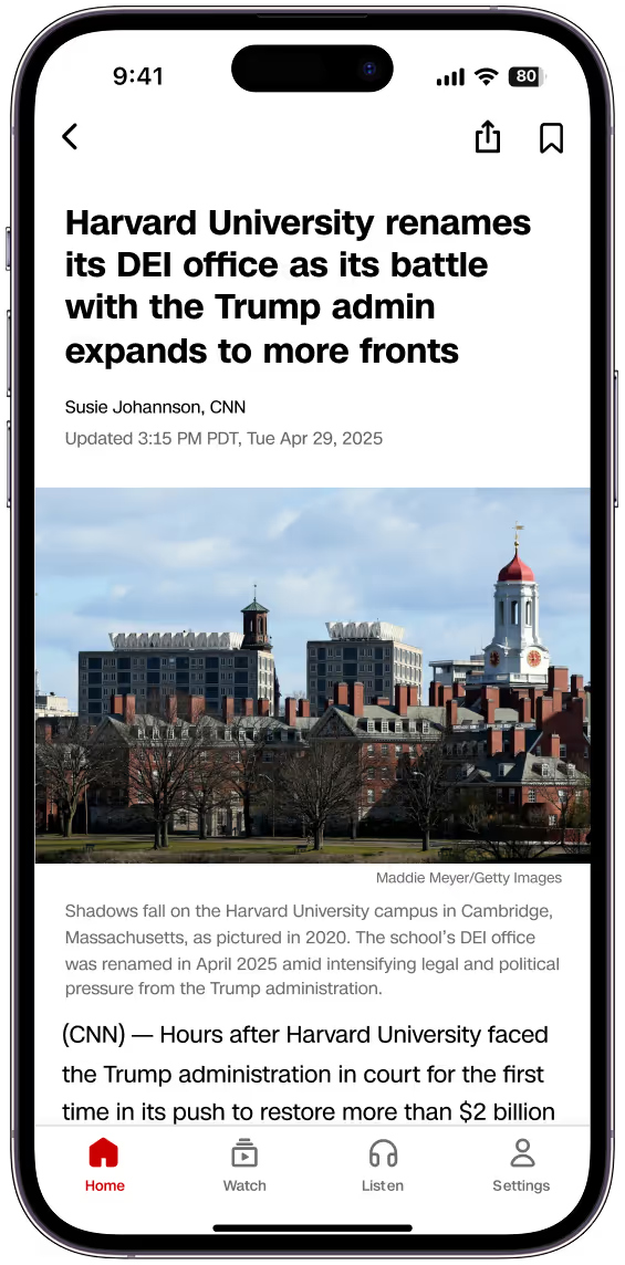
Story type appears up front so readers instantly know what kind of article it is.
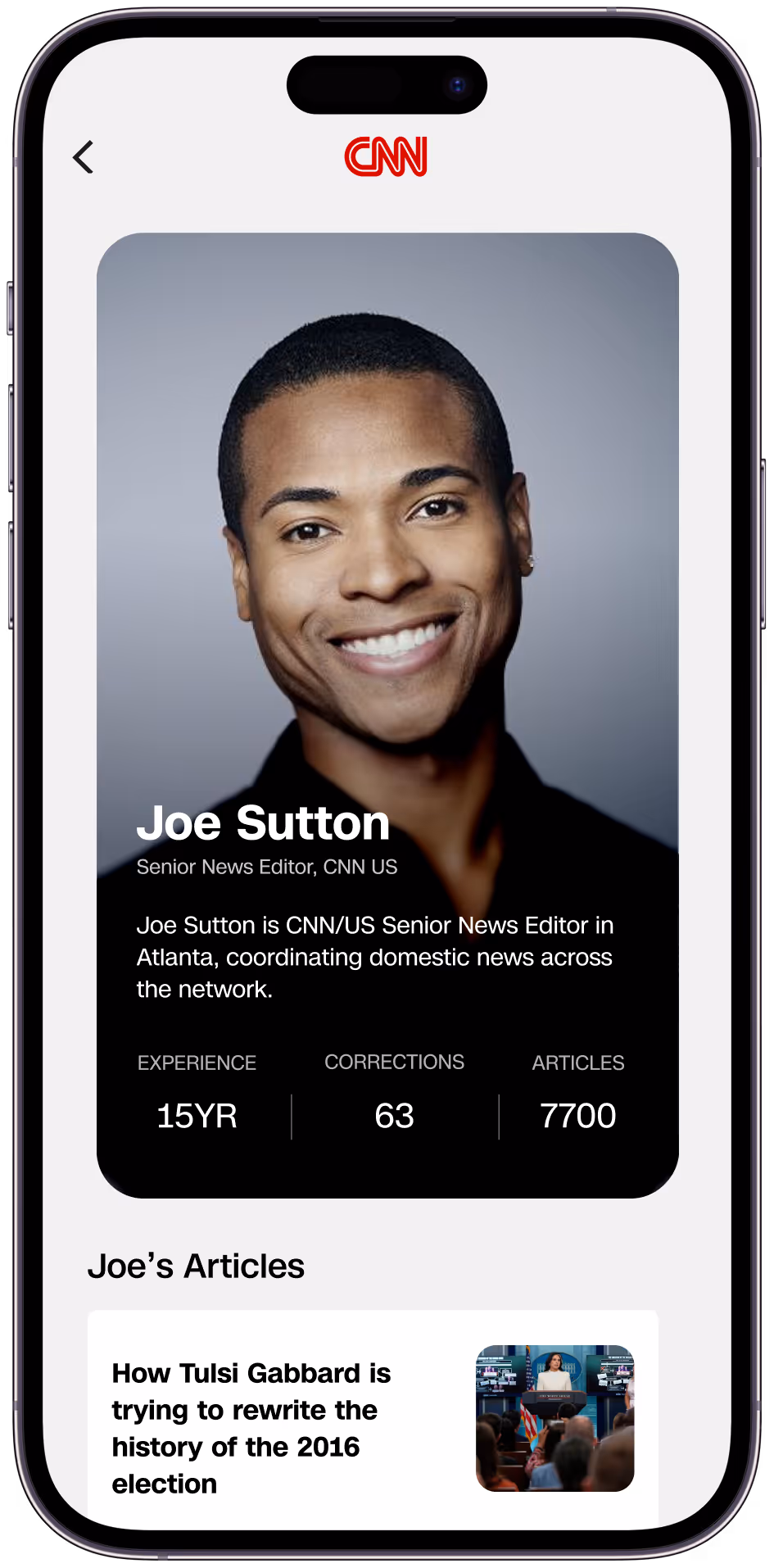
Author page highlights the journalist’s bio, experience, and body of work.
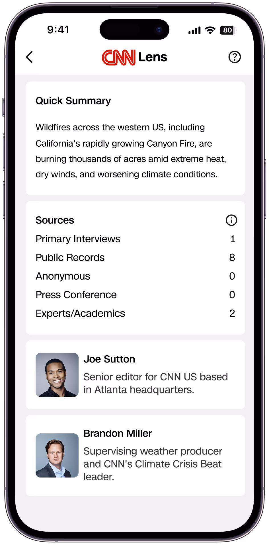
Lens shows a summary, sources, and context so readers can dig deeper.
We gathered feedback from journalists, design leaders, and ran 5 rounds of usability testing, which surfaced key learnings that shaped the next design.
Readers who discovered Lens on their own reported higher trust.
Trust couldn’t rely on a separate feature, it needed to surface in the article flow itself.
Many readers ignored Lens unless prompted, showing transparency cues were too hidden.
Progressive Disclosure Before Lens
Visual Cues
Expert tag surfaced inline to signal credibility without breaking reading flow.
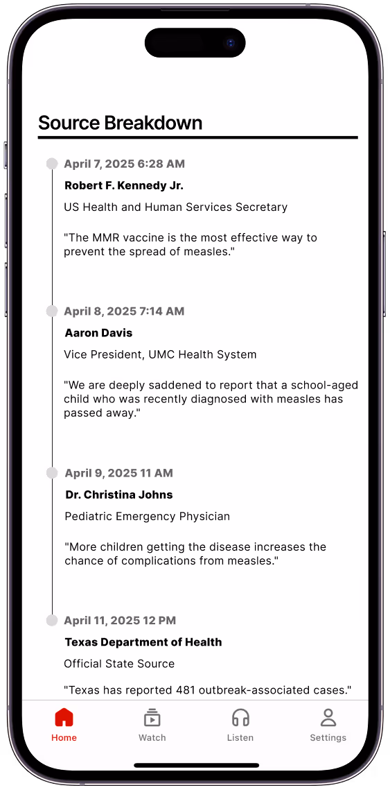
Clicking on a cue highlights the source and reveals more context about their perspective, helping readers understand why they were interviewed.
Walkthrough
Learnings
Critiques and testing with CNN, journalists, and readers taught me to pivot, refine, and not get attached to a design.
Trial and error in research revealed which methodologies gave meaningful outputs to focus our approach.
Learned that scrappiness beats polish, and constant iteration with users led to the final product.